

Neal’s Yard Remedies
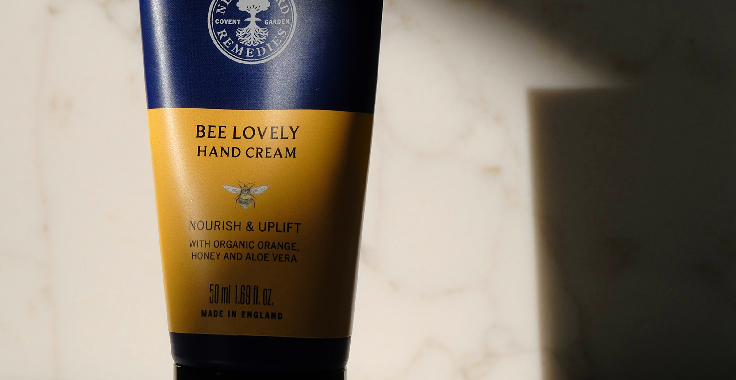
We were commissioned by Neal’s Yard Remedies to refresh their packaging design and evolve the brand’s visual expression. We refined collection colour palettes, introduced more versatile typography, and developed bespoke illustrations, supported by a comprehensive framework of packaging guidelines.

photo © Rowan Lowe; © Neal’s Yard Remedies
Studio Breve was commissioned by Neal’s Yard Remedies to refresh their packaging. Through refined colour palettes, versatile typography, bespoke illustrations, and a new packaging framework, we established a cohesive graphic direction that was subsequently adopted across the wider brand.
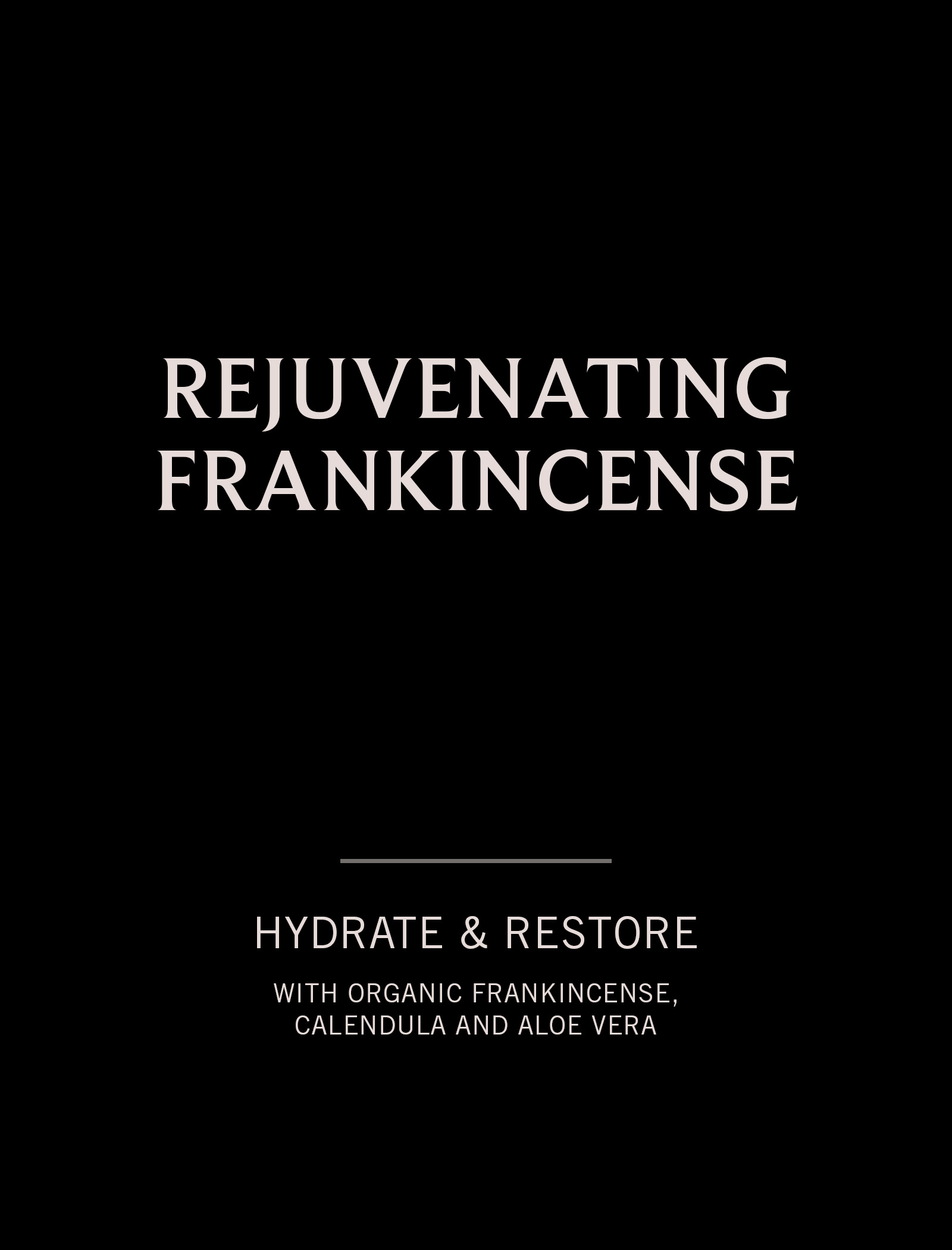
Rooted in nature and known for its distinctive cobalt blue packaging, Neal’s Yard Remedies sought to unify and elevate its visual identity while honouring its heritage. Drawing inspiration from archival labels, we refined hierarchy and clarity to create a more timeless, recognisable design that balances the brand’s apothecary tradition with a contemporary sensibility.
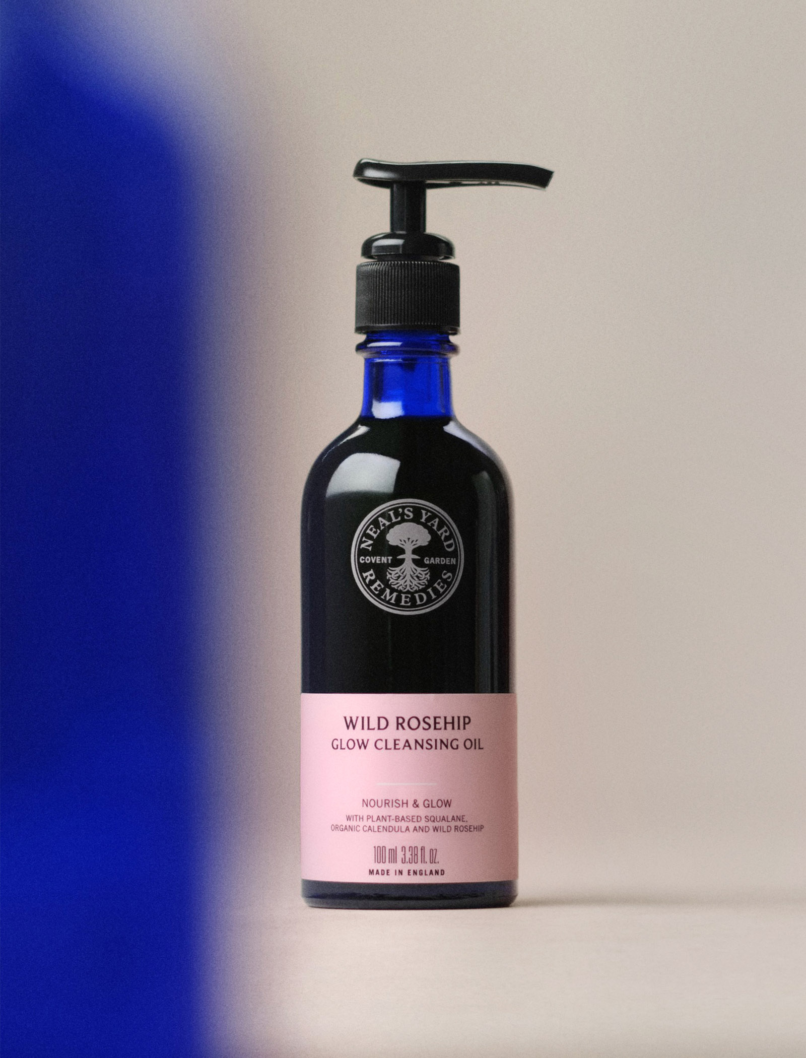
We chose Beaufort Pro as a new headline typeface, pairing its softer serifs with NYR’s classic Trade Gothic. We shortened the labels to reveal more of the iconic blue glass and refined the colour palette to make product categories easier to identify.
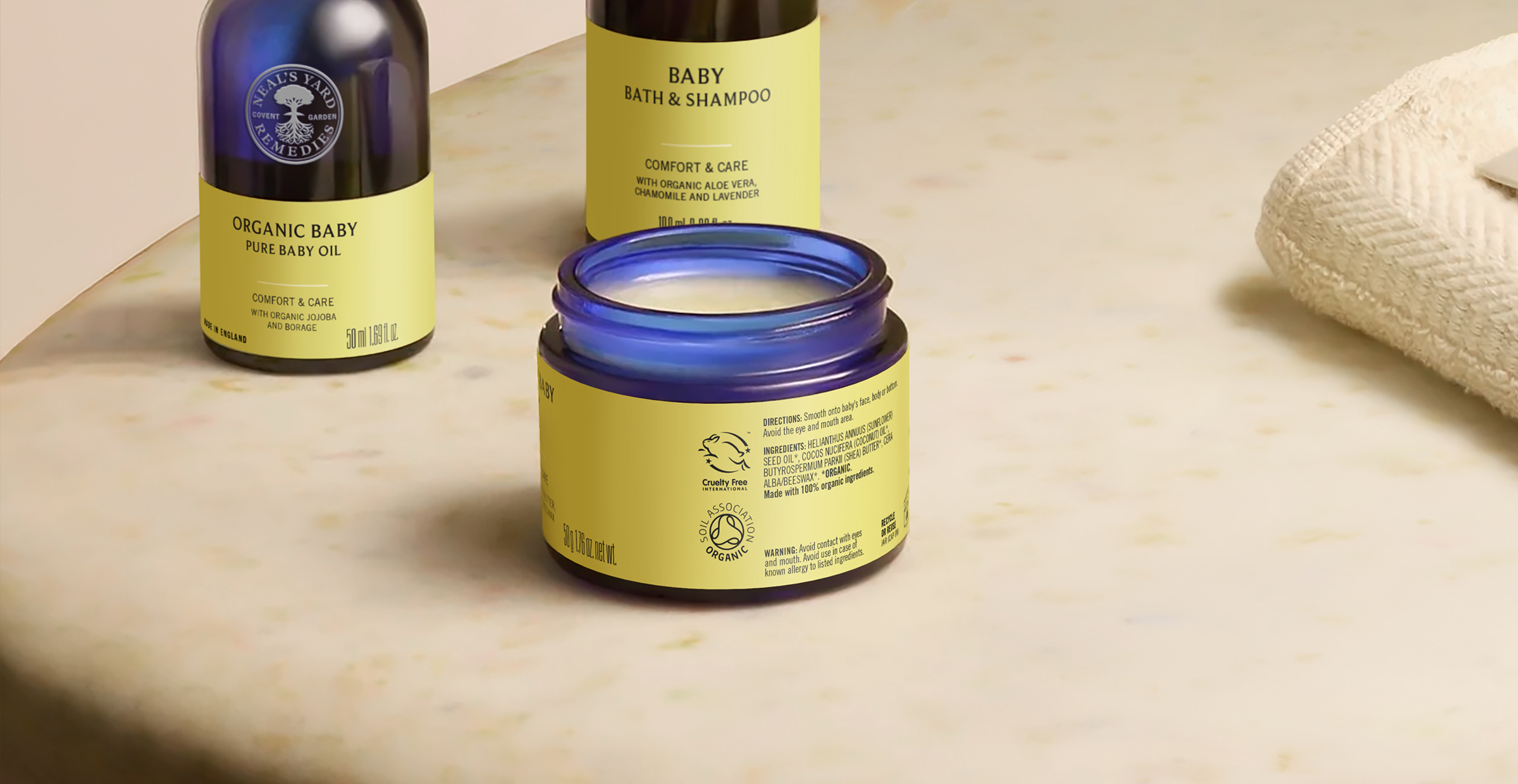
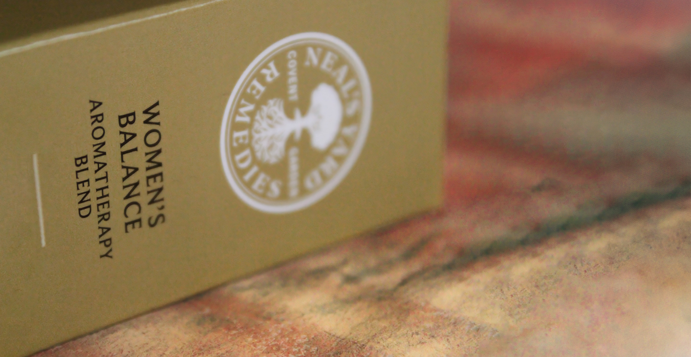
We reworked the reverse of pack to make information easier to navigate. Content was reorganised for quicker scanning, while accreditations were given more prominence and made easier to identify. To support consistency going forward, we also developed a set of packaging guidelines for future applications.