Sunny & Luna’s packaging design
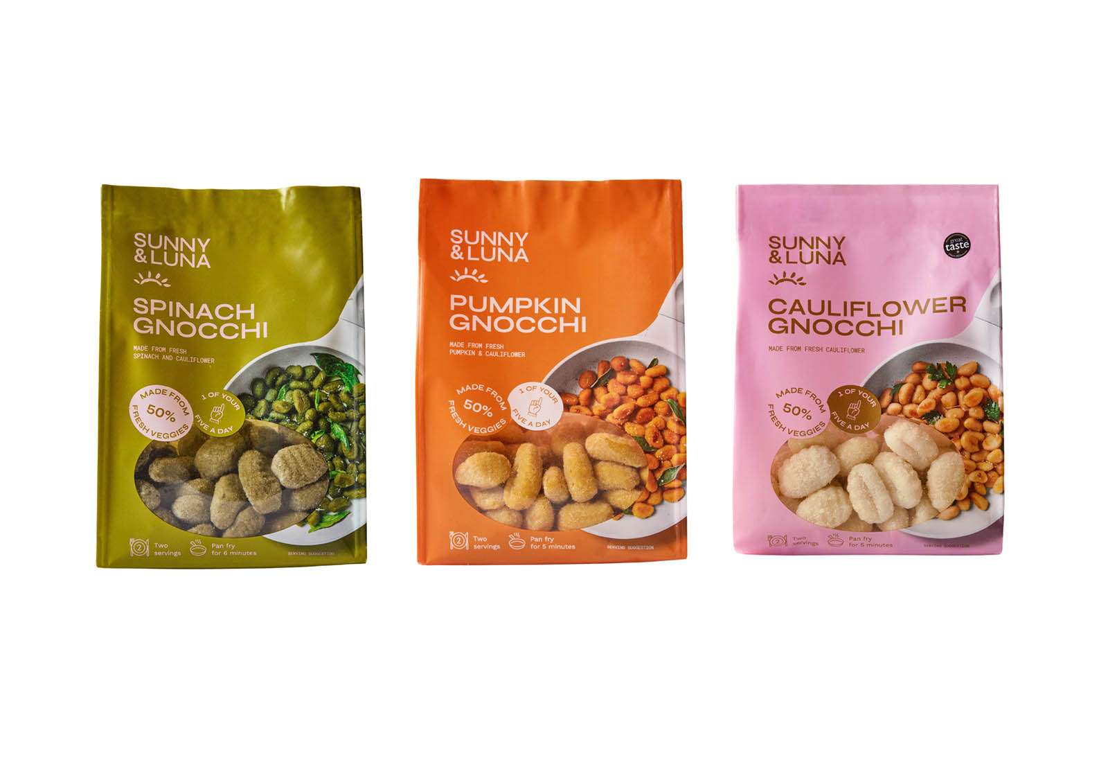
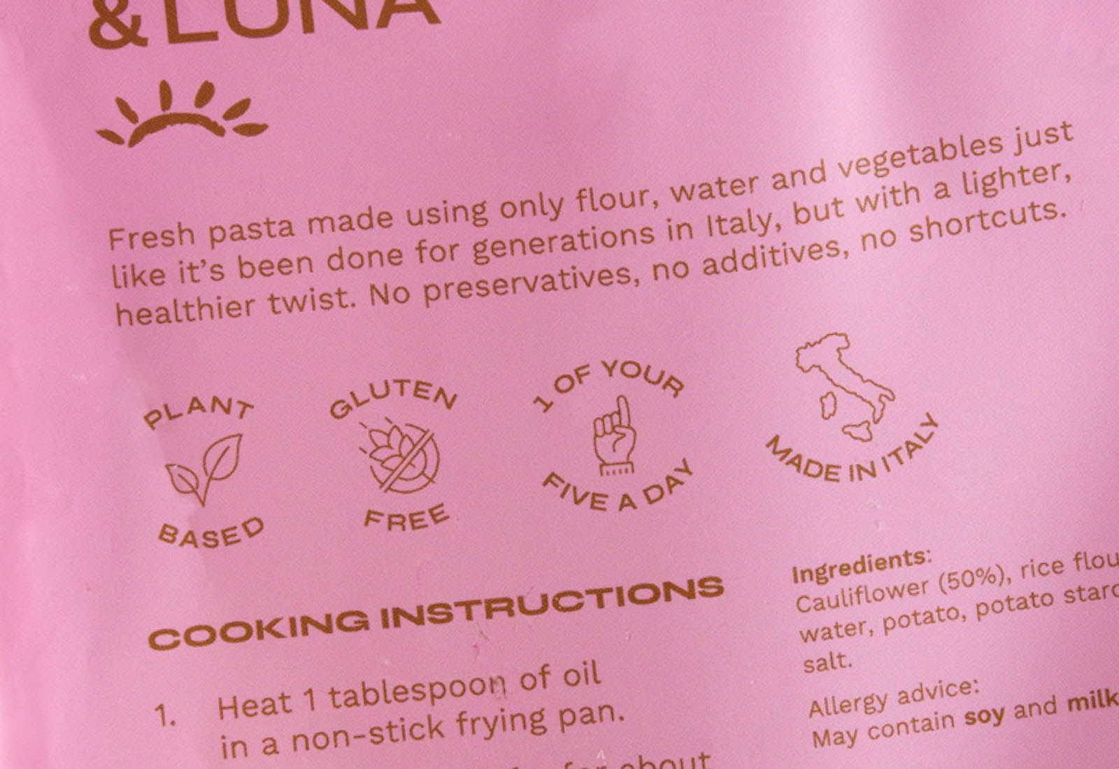
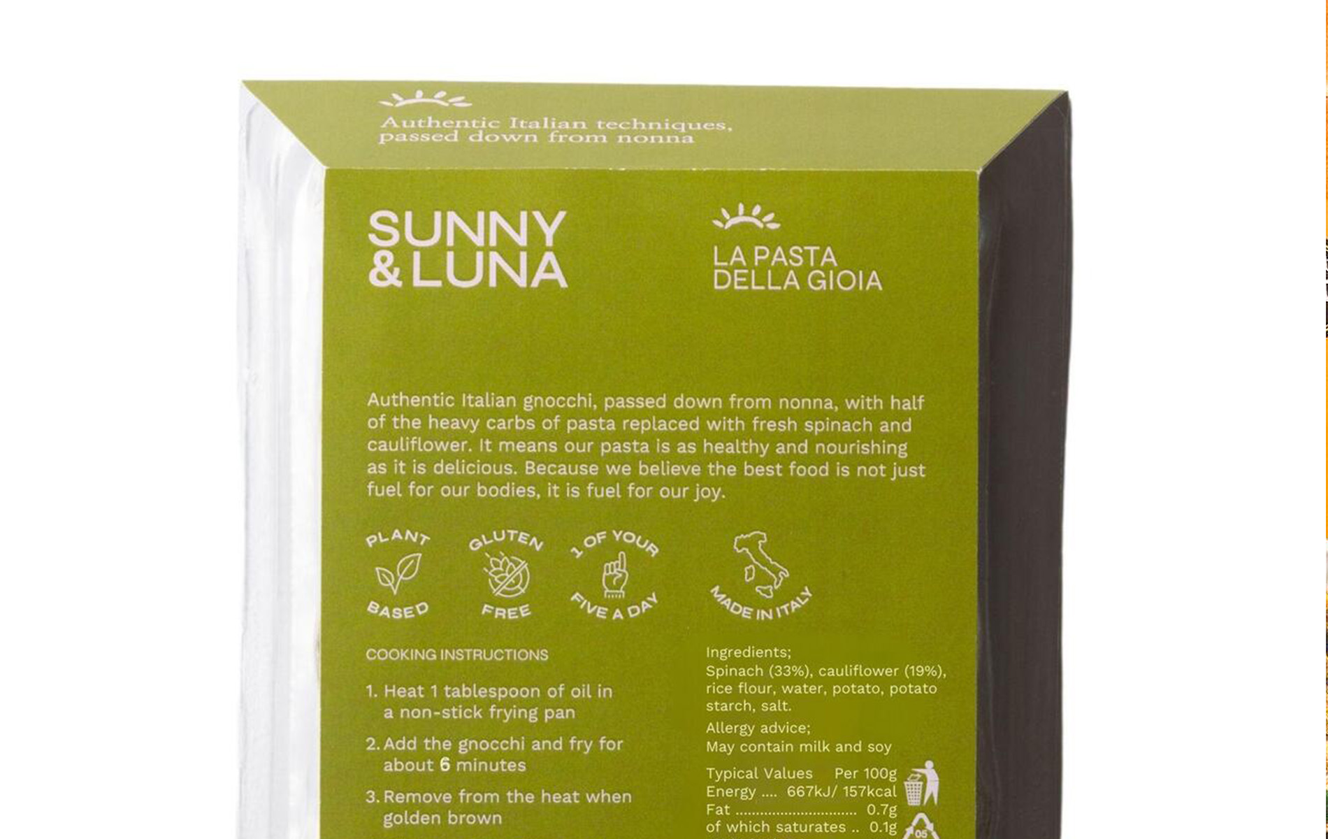
Sunny & Luna make artisanal fresh pasta with an added vegetable twist. They’ve reworked traditional Italian recipes to make them lighter, extra nutritious and more appealing to their customers.

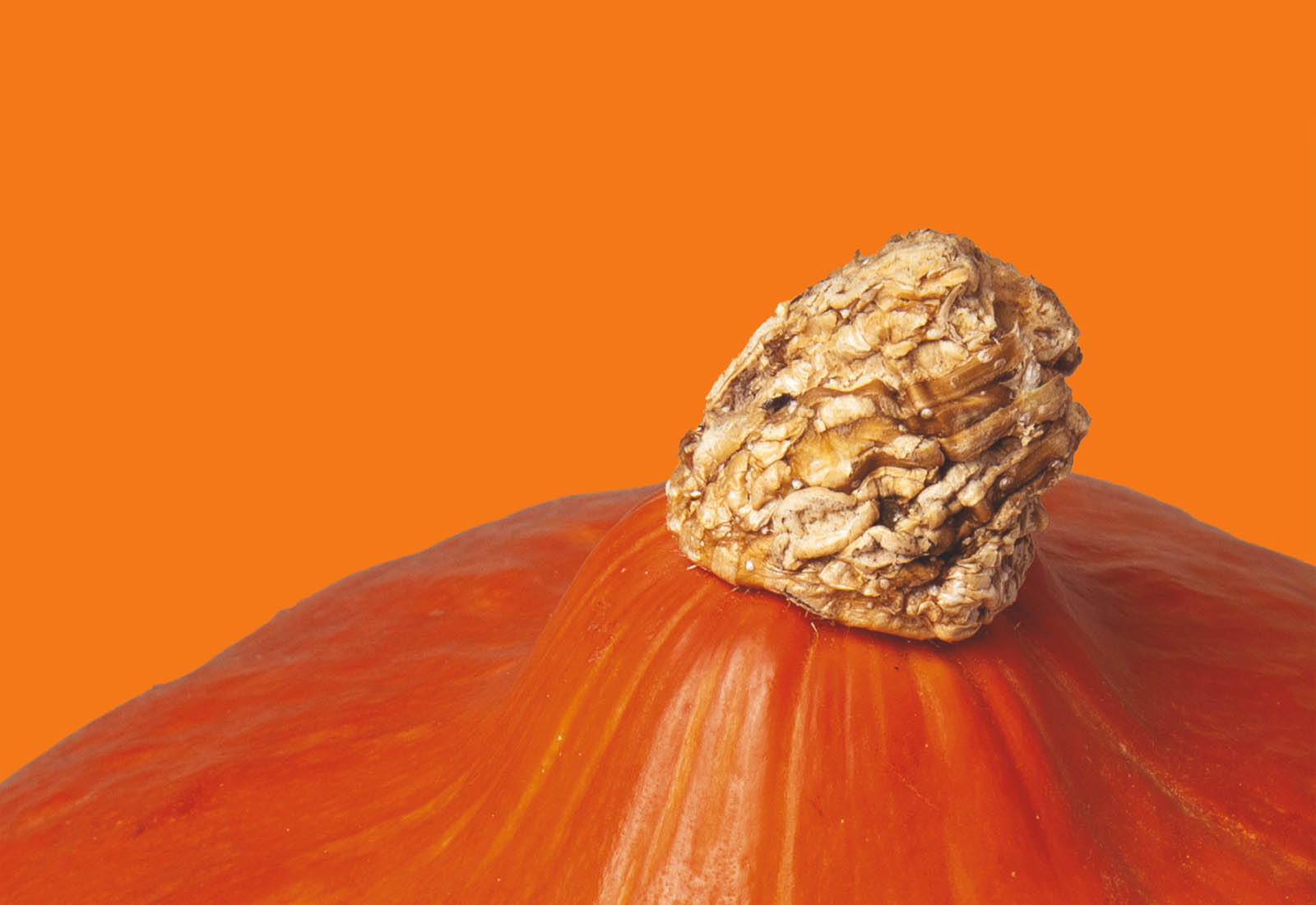
lifestyle photos © Sunny & Luna
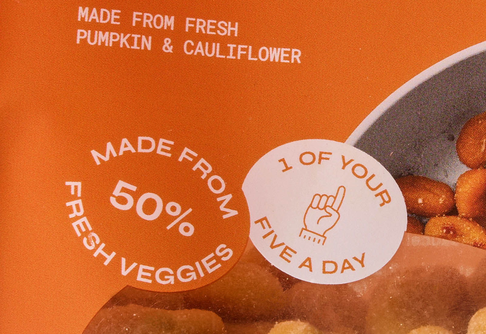
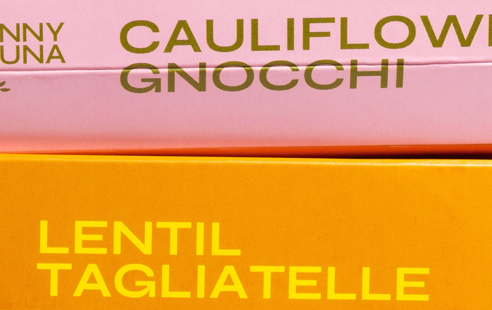
In developing packaging for their original recipes, nostalgia was a key ingredient. The large typeface and retro colours we paired promote a playful feel. We designed fun stamps marking the brand’s stand out elements. The bright bold look we created is reminiscent of the 60s-70s when Nonna was cooking up a storm. Our packaging reflected that it’s a young, design-focused brand.
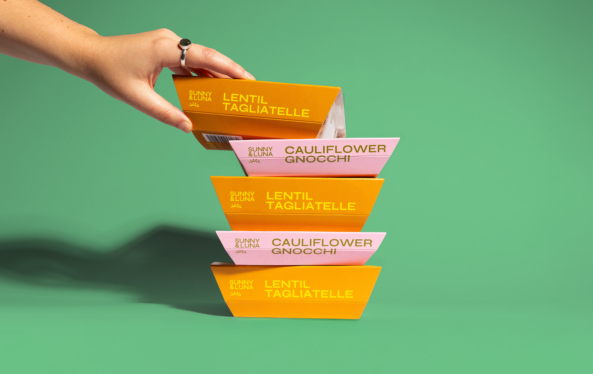
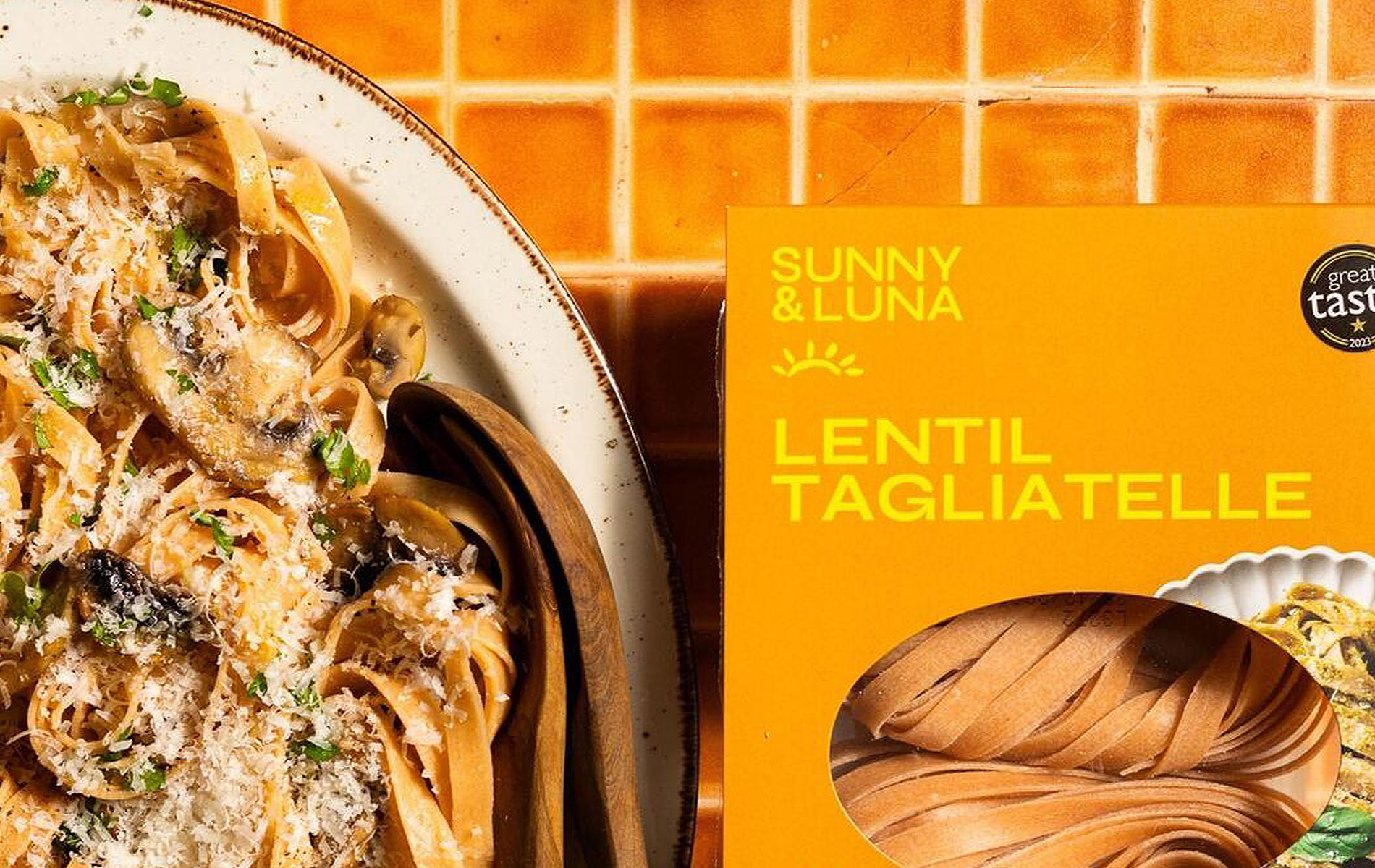
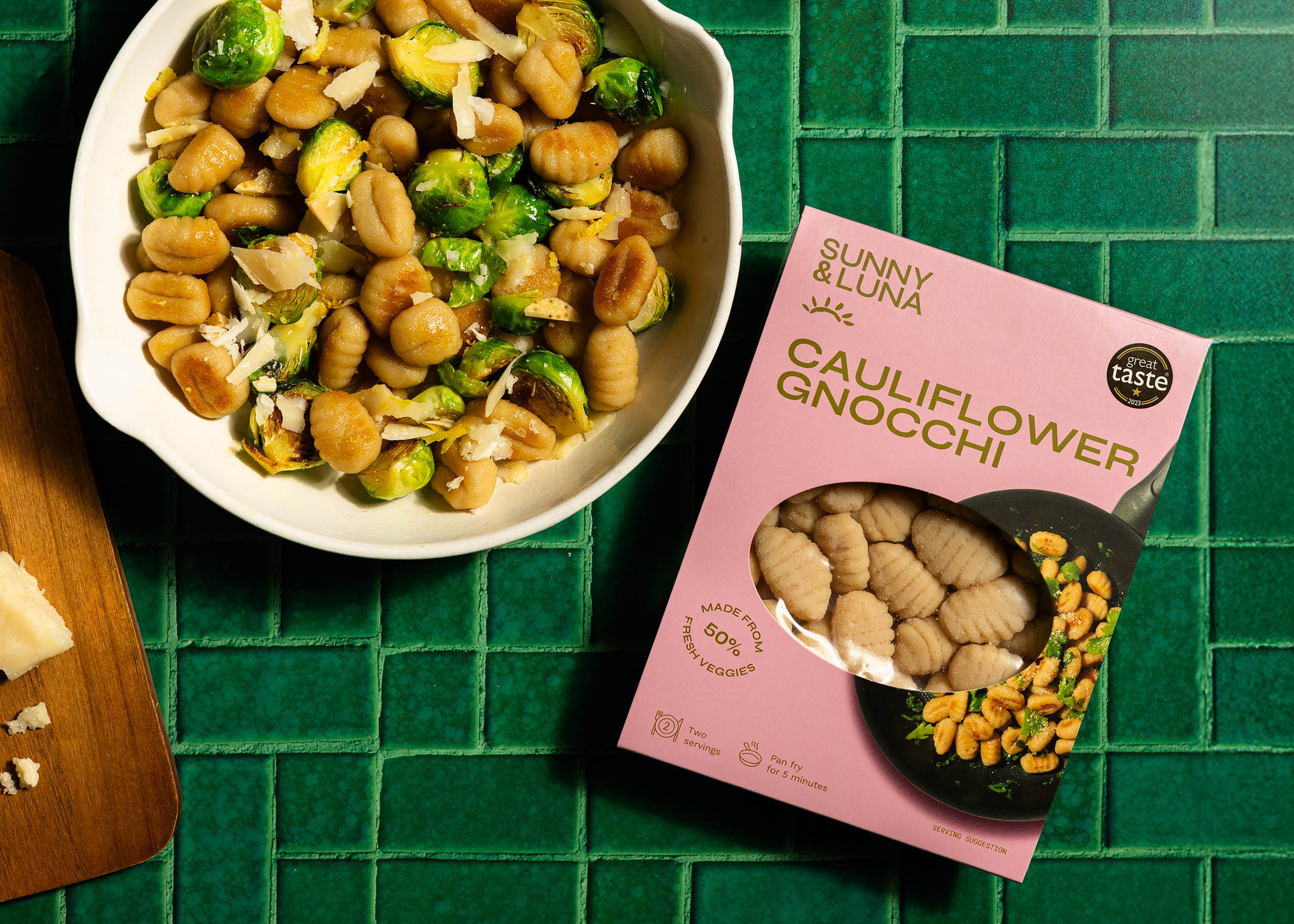
Launching in major retailers and supermarkets marked a transition to a simpler packing process and an adjustment to the design for wider appeal. Studio Breve helped Sunny & Luna retain the essence of the brand, whilst moving to a new format. As well as reworking the packaging for existing recipes, we developed new designs for an additional recipe.